
CHASE UK
Creating a new visual identity
Establishing a visual design direction for the Chase UK marketing website, in a competative UK marketplace.
The story so far…
Business Objectives
Our primary goal is to deliver a comprehensive marketing website specifically tailored for the UK market. We were working against a tight deadline to ensure that this website functions effectively as an acquisition platform to support and enhance our core product's outreach and engagement.
Customer Objectives
The website will enable potential customers to easily sign up for our services while also providing an authentic representation of our brand. It is essential that we convey a clear and engaging sense of who we are to customers in the UK, fostering trust and connection from the outset.

I joined the web team early 2021, collaborating with another UX designer.
We devided and conquered the task - me working in visual design & design systems, him purely UX. By splitting the bill we managed to tackle the increasingly tight deadline to launch.
Research
Before I jumped on board some research had already been carried out:
The brand & marketing team had done extensive reserach into the market, both in the US and UK. They had created personas and carried out public brand awarness tests.
The design team had carried out internal workshops, user testing on market analysis, behavioural and competitor research. Formulated an IA approach.
The app design team had done extensive user testing into card discovery, creating and managing mutiple accounts, payments, etc - which we could leverage in our content.

The big ask
The brand, marketing and design team did not feel that the design direction to date was in line with the current brand proposition. The marketing team was also trying to solve this issue in other areas; out of home advertising, social media, web banners - all in flux. They asked me to explore some design ideas that could help define the design direction for the website and in turn set the cogs turning for a UK brand guideline.
Where to start?
Well, the best place to start was by analysing the current work. The IA was relatively small at this point, with most effort poured into Home, Account, Articles Hub, and Support. I focussed mostly on Home and account as these had to do the most lifting in the sense of educating the public, but also selling the product to prospective customers.
Here I identified issues that I would later refine.

Competitor analysis
Our parent company was in the US - it’s a mighty beast there. So it made sense to see what was going on over in the other side of the pond. Our brand mission was to share core assets; logo, colour palette, font. Beyond that we had free reign in UK to target the homeland audience. I could see that Chase.com was defining the current direction thus far, but it had issues of it’s own.
I was more interested in what the competition was up to and how they defined themselves. So I looked into many heritage and disrupter banks (some shown here), and their homepages and current account pages.

Analysis outcomes & design approach
I formulated my observations, and outlined an approach, whilst taking into considerations that affected current team tasks and timelines. This is what I needed to do…

Visual identifiers
Considering the abundently blue nature of the finance market, it made sense to start exploration of new visual identifiers that could differenciate us from our competitors. The idea was to remain contemporary but mix things up. The most logical starting point - the Chase logo…

Global type scale
A core issue I identified was the treatment of text across the website. This deserately needed tidying up; heading heirarchies didn’t flow, text was massive and ultra bold - none of this aligned to any other brand materials. I worked with our current design system designer to create a cross-platform global text scale that could work for app, web and print materials. Using a golden ratio and a secret algorythm we created and thoroughly tested a 22 step scale.
Satrting with the base value (1 rem = 16px) I created an updated heading heirarchy usign the new global type ramp.

Text vertical rhythm
Once the type scale was established, I worked with developers to create an associated padding scale that would allow heading and paragraph elements to stack with consistent spacing, allowing a document to flow with ease of readability in mind. A different value was applied to each H, body, and ul value across 2 breakpoints; mobile and desktop.

Device & app presentation
Since the app was our core product, it was important to celebrater this wherever it wwas displayed. I created a new device frame that was agnostic of platform/brand, as we were building both an iOS and Android app. These frames took on attrbutes of the app UI iteslef with the soft blue dropshadow, shifting focus purely onto content.
I further developed 3 incremental zoomed states to maximise flexibility of content presentation. I also explored a series of presentaitons that used app screenshots and videos, as well as abstracted visual presentations for data purposes.

3. Component refinement
I intially focussed on refining the core components to ensure dev commitments were reasonable, but later was able to explore new content presentations and layouts. Here I will outline the overhauls of a select few for launch. These were recreated in the design system and additional features and requirements added as co-pilot required new gear.
Component: Lifestyle hero
The lifestyle hero is the highest performing component in our arsenal, in articular that blue button - with an 8% average monthly download conversions. This means that when someone comes to the website, it better ooze Chase!
Improvements:
New chase container shape applied. The corner proved tricky to implement in Figma, but the same method was applied to code.
New text scale applied.
Text legibility and AA contrast compliance - done through the use of white text and a separate layered vignette gradient that runs between the text and image. Body copy also white.
Image guidelines - Image must convery Chase lifestyle. I created guidelines that would ensure that the focal point was in frame across mobile, tablet and desktop. Handed to marketing team and contunously governed.
Responsive across any size between 375 & 1920px - supporting our 4 breakpoints and an additional 1920px wide screen breakpoint that we added a little bit later.
Badges added later when we won some awards!
Built in design system and delivered to developers.

Component: Product hero
The product hero is variant of the lifestyle hero but focusses on the product, highlighting the core features; in-app & card.
Improvements:
New chase container shape applied with branded blue background. Included a diagonal element to drive home the branding.
New text scale applied.
Image - Created a faux 3D device with a current screenshot & card. Also used in app onboarding experience.
Responsive across any size between 375 & 1920px - supporting our 4 breakpoints and an additional 1920px wide screen breakpoint.
Badges added when we won some awards!
Built in design system and delivered to developers.

Component: Feature block
Features are concise blocks of information with an associated image that span the page in an alternating pattern. Content must be concise to deliver a quick read, offering consumers a way to learn more. Topics must be singular in nature to ensure message is easily scannable and understood.
Improvements:
Applied; new text scale, updated image presentation
Worked with my co-pilot to implement new features; lists, lables, logos
Built in design system and delivered to developers.

Component: Promo
Promo banners reinforce or promote an action that is beneficial to the customer and business. It acts as last port of call for sign-up, and is consistently placed on all pages to act as a catch-all for app download.
Secondary promo was created later to promote additional features & onward journeys. Always paired with the primary promo.
Improvements:
Applied: New container, gradient and design elements. Images peak out of container to increase visual interest.

Component: Feature full width
Full width features are a variant of the default feature component that is more image lead, stretching from edge to edge with content overlaid. It allows for more interesting page layouts by breaking the pattern up.
Improvements:

Component: Carousel
Carousels allow a large amount of information to be presented within a small footprint of the screen.

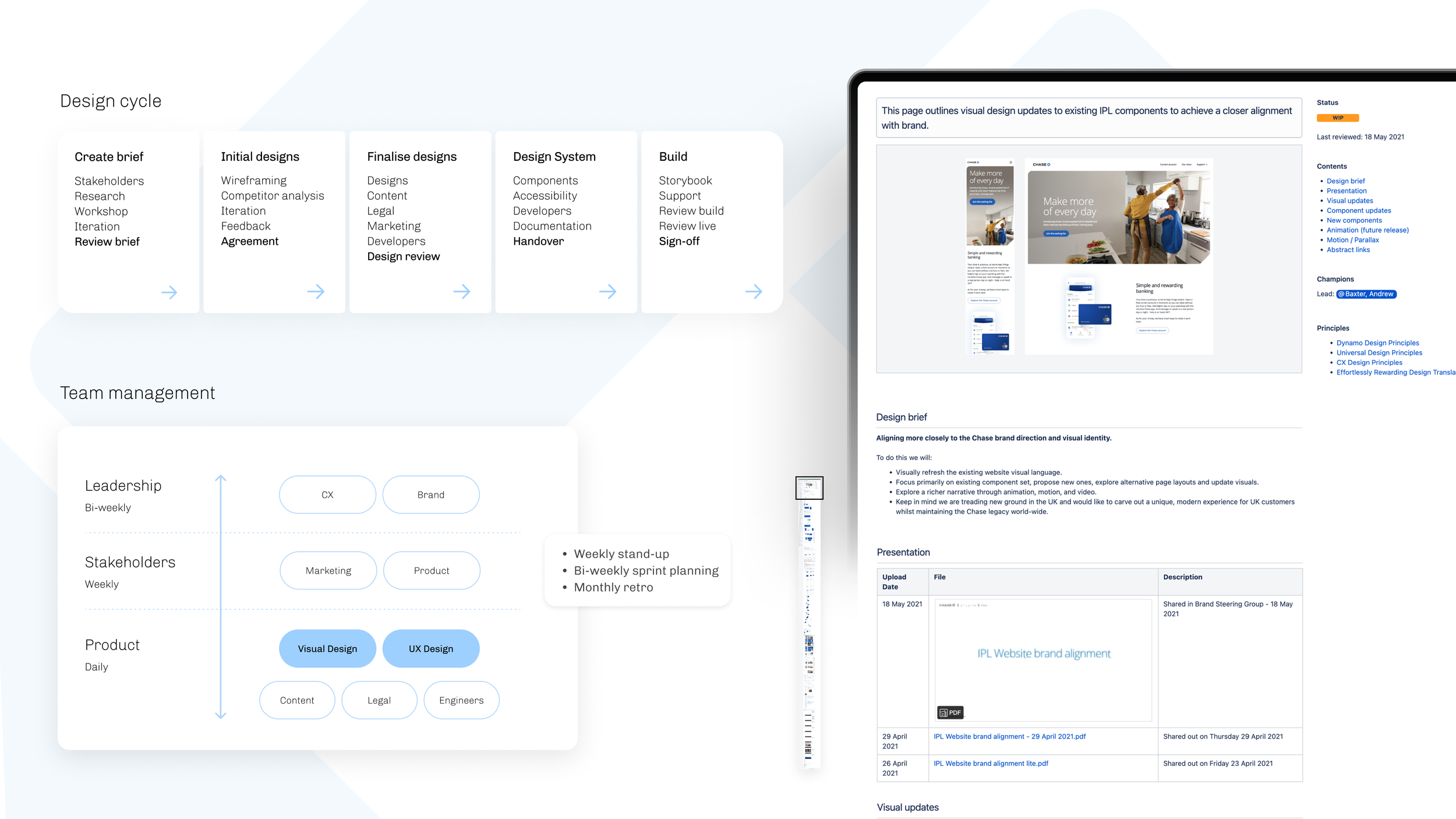
Stakeholder management & reviews
Created a page to track designs and conversations.
5. Guidelines and rules
Guidelines
Guidelines were an important part of capturing direction, but also ensuring that content created was strictly adhered to for optimal output. From right to left:
Image sizing and guidelines: For creation and output. This document covers all components that contain imagery and allows a creative to access a working template, directions for image creation, and output types.
Image optimisation: Instructions for how to optimise imagery output type, reduce filesize and remove unwanted metadata.
Content: Guidelines per component outlining criteria that applies to content team and developers; string length, scale, wrapping, scaling.

Guidelines: Hero
Guidelines for the marketing team to create imagery for heros.

Guidelines: Device
Guidelines for the marketing team to create imagery for device presentation.

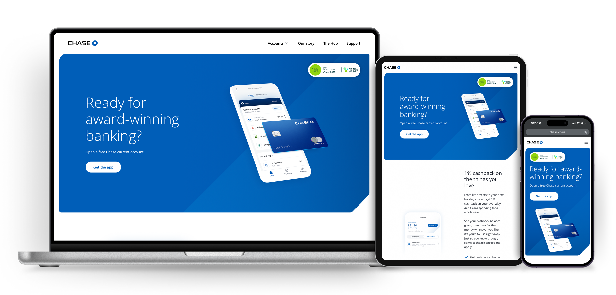
Result: Homepage
Content spacing is a system to ensure pages are laid out consistently across the website, and information is easy to scan and digest. Created in partnership with developers.

Result: Account page
Content spacing is a system to ensure pages are laid out consistently across the website, and information is easy to scan and digest. Created in partnership with developers.
Outcome
Content spacing is a system to ensure pages are laid out consistently across the website, and information is easy to scan and digest. Created in partnership with developers.

Outcome
Content spacing is a system to ensure pages are laid out consistently across the website, and information is easy to scan and digest. Created in partnership with developers.
Reflection
Content spacing is a system to ensure pages are laid out consistently across the website, and information is easy to scan and digest. Created in partnership with developers.

2. Visual explorations
1. You’ve gotta start somewhere
Motion & tokens
As a team, we defined motion principles across app and web. Later hiring a contractor to go deeper into defining the principles, logic and application of motion in design.
I formulated the parallax principles for web through a series of protoypes and working with developers to implement. This allowed hero images to have a sense of depth and fluidity. Illustartions could be paired devices and move at different scales allowing a deeper sense of control as the user scolled. We implemented animation using a combination of Adobe Aftereffects and Lottie, keeping files lightweight and latency to almost zero.
